Rebranding a historic British Formula 1 Team in a timeframe that felt as fast as the sport!
Challenge
When their title sponsor ended the contract a year earlier than anticipated, WilliamsF1 needed a whole new identity. From the team logo to the design for the car. Motorhomes, trucks, drivers’ overalls, helmets. Everything needed to be redesigned for the next season. And fast.
Williams has long been known as the ‘blue-chip’ Formula One team. Their sponsors tended to be large corporate organisations and the leadership team felt that the identity needed to nod to that. They also have a long and illustrious history of success in the sport, dating back to the 70s. Clearly, F1 is fast-paced and progressive, so the new brand needed to unite the proud history of Williams, with the forward-thinking, technical world of F1.
Solution
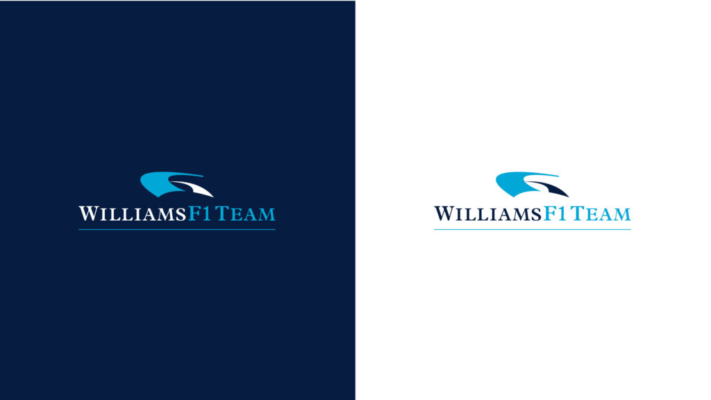
To combine elements of old and new. Key lines and flowing shapes, represent the aerodynamics, the airflow, over the car that keeps it pinned to the ground. Although elegant, they are a nod to engineering prowess and technology. The poised serif typeface represents the history and pedigree of Williams as an F1 team. The logo depicts 2 curves of a racetrack, forming an abstracted F and 1.
WilliamsF1 Team logo for the 2006 season
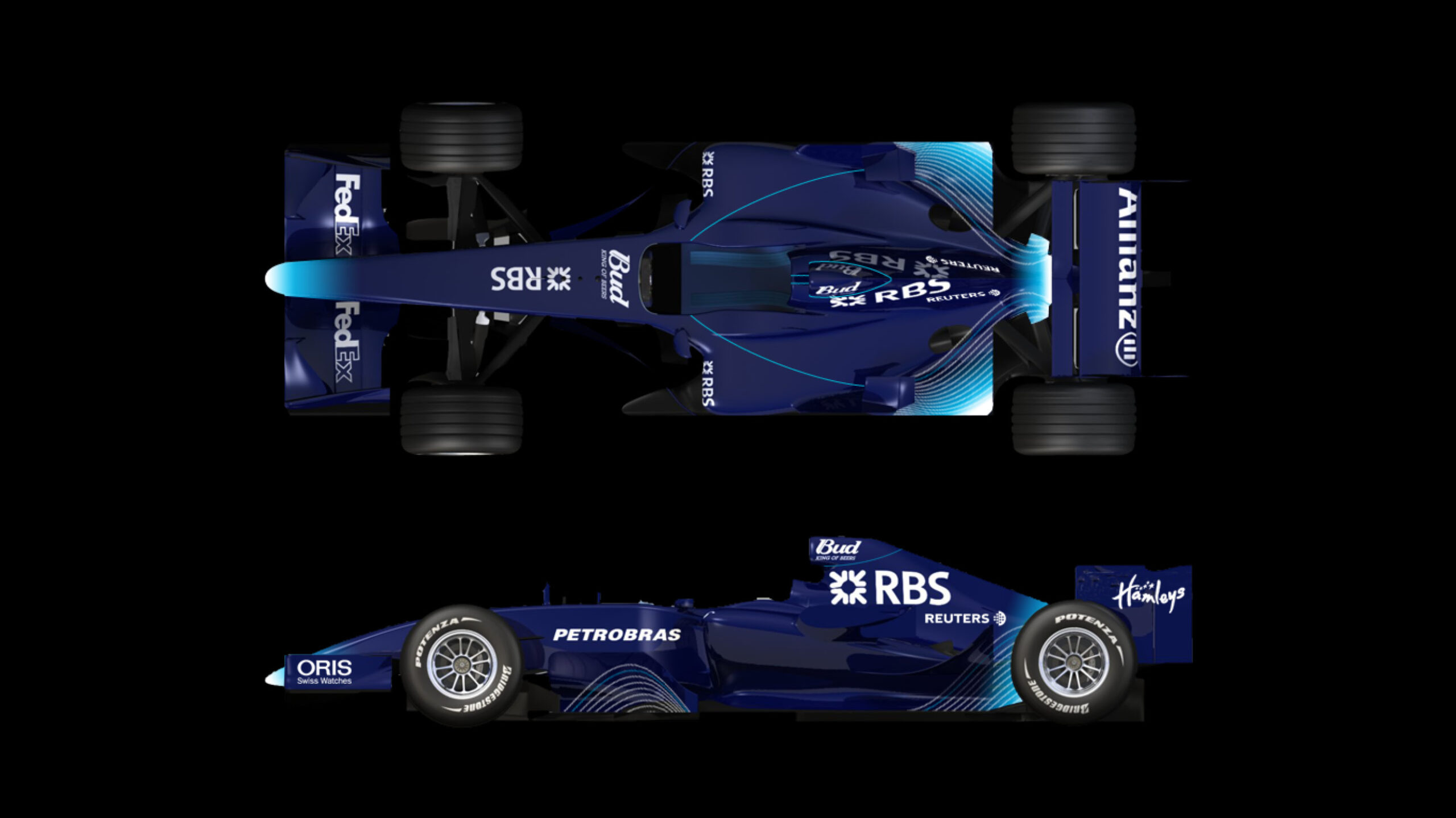
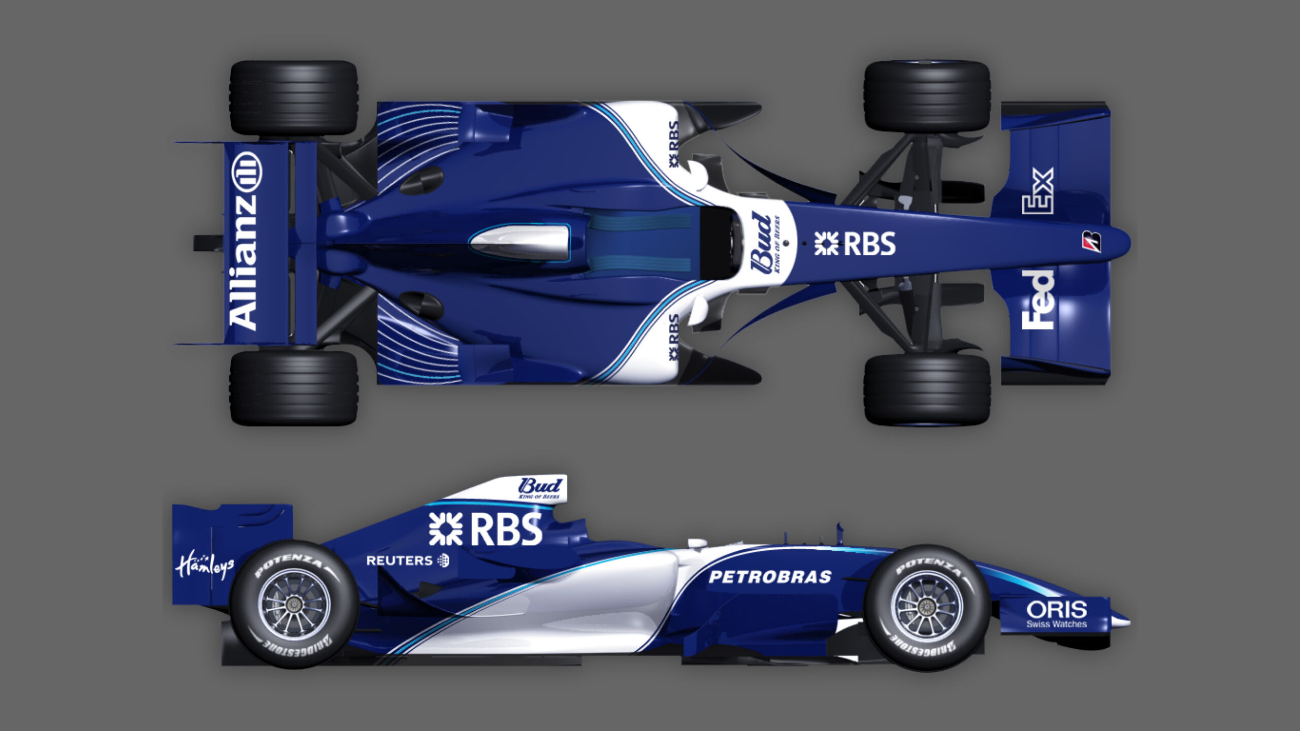
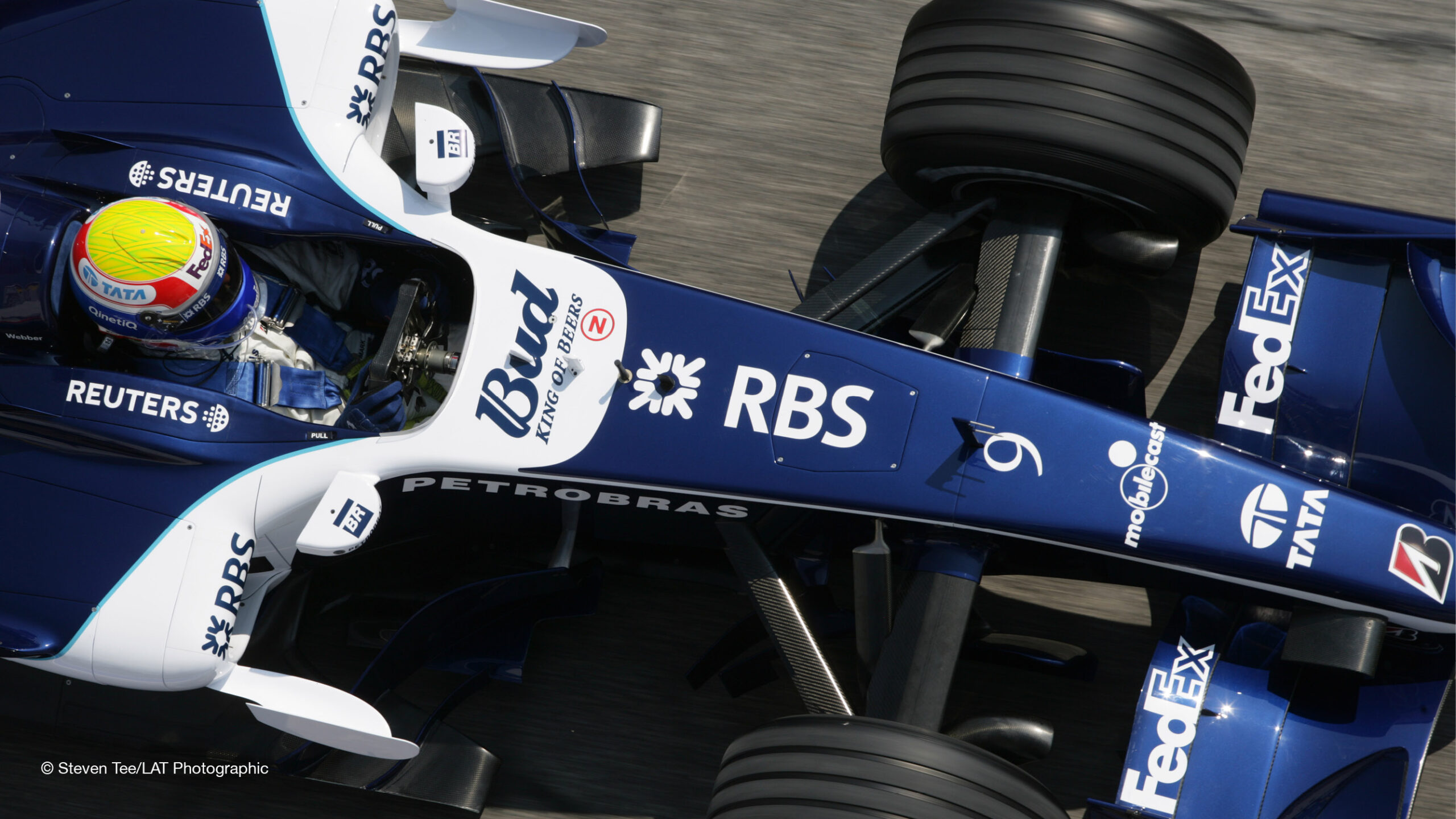
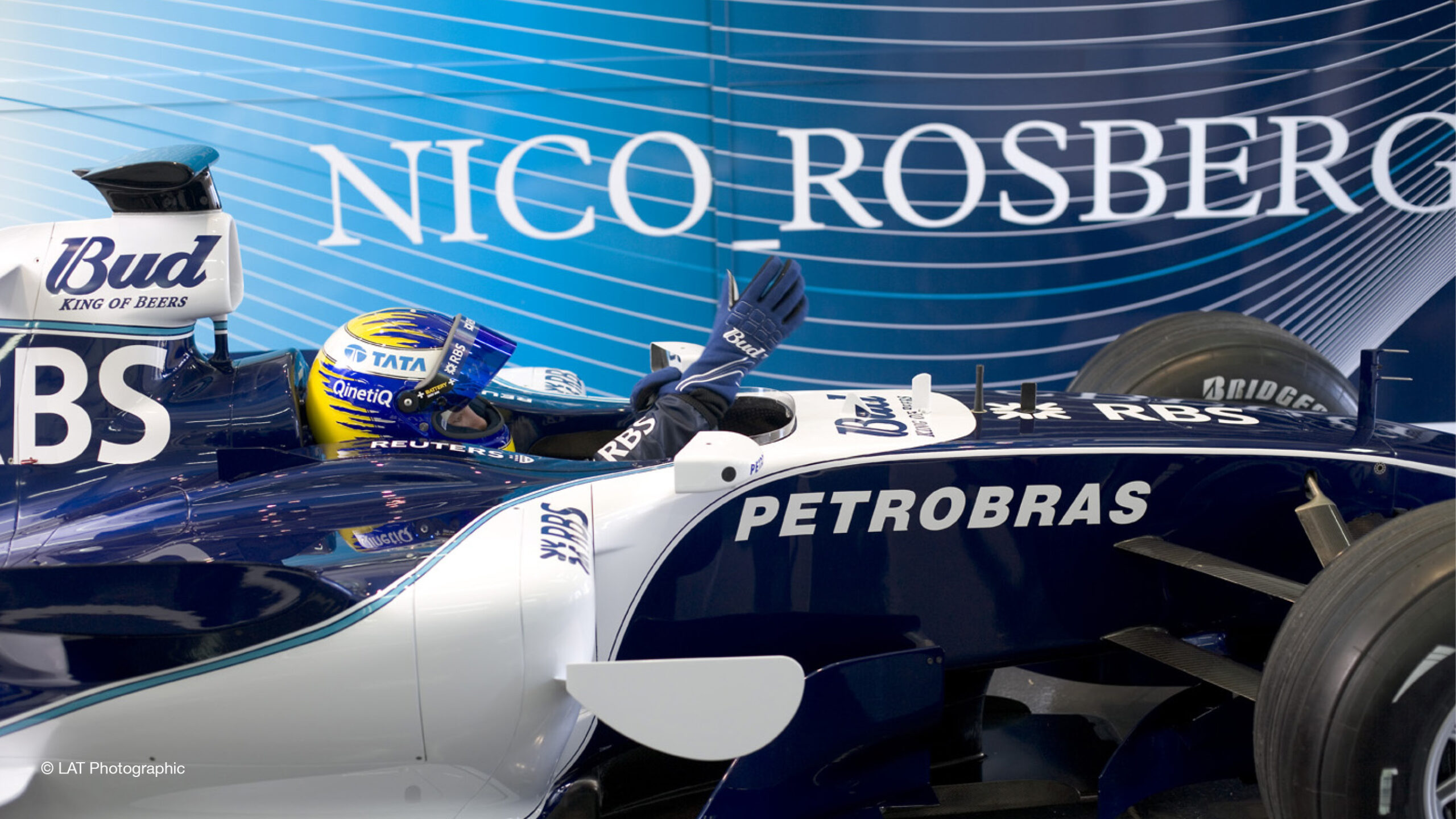
FW28 Livery designs from initial concepts to the car on track

Pit wall board designs
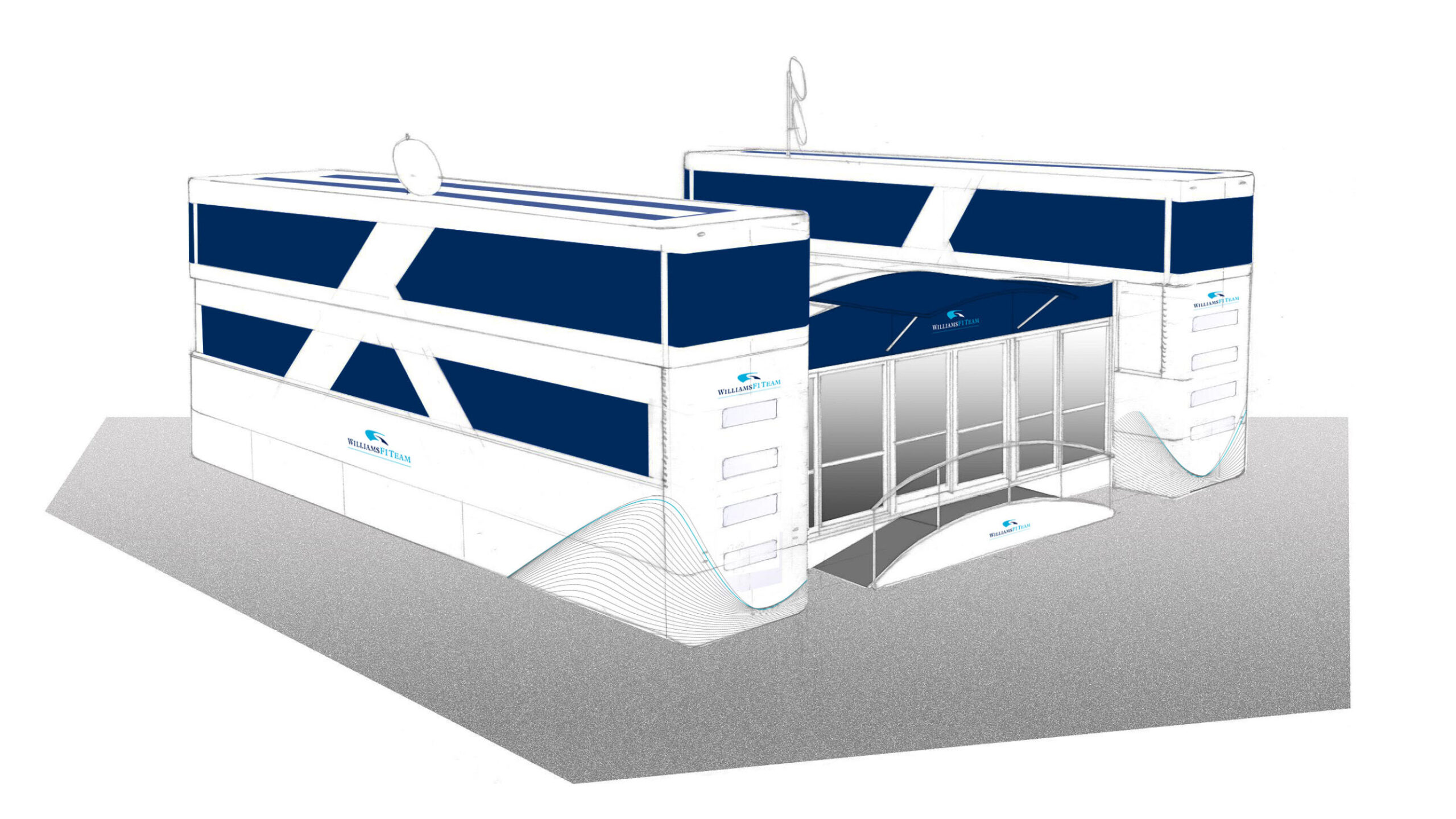
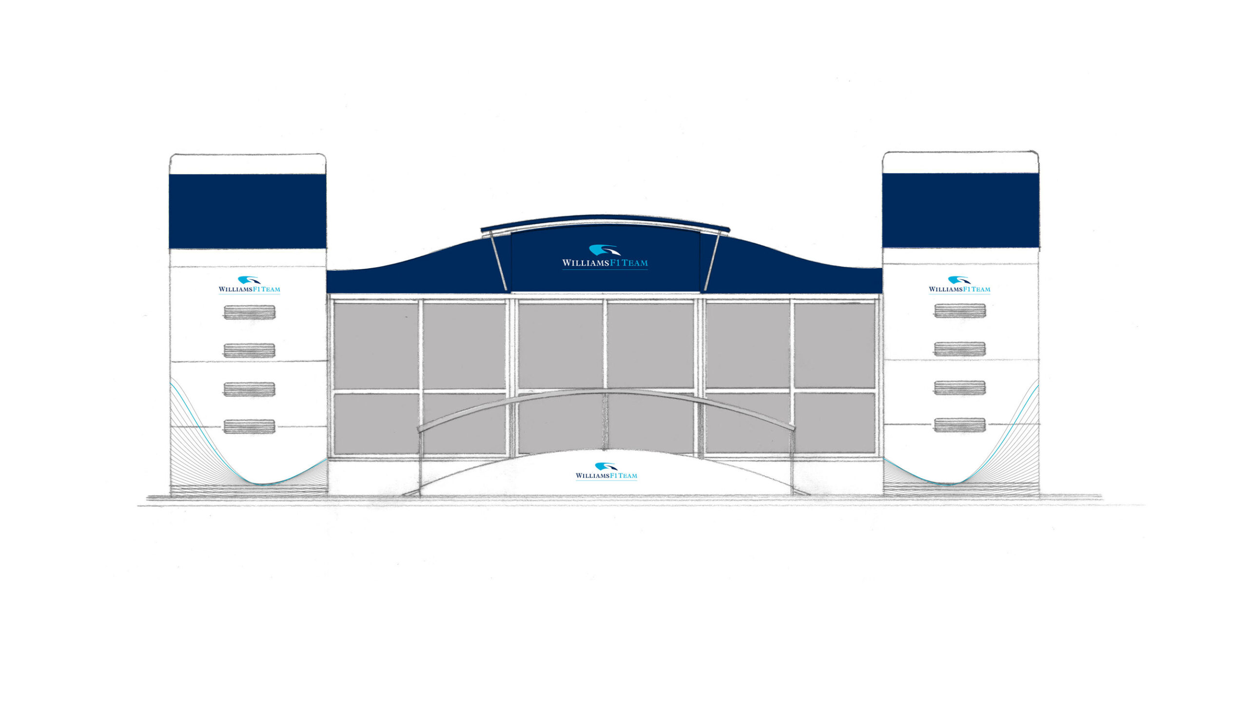
Motorhome designs
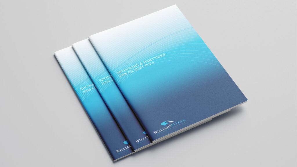
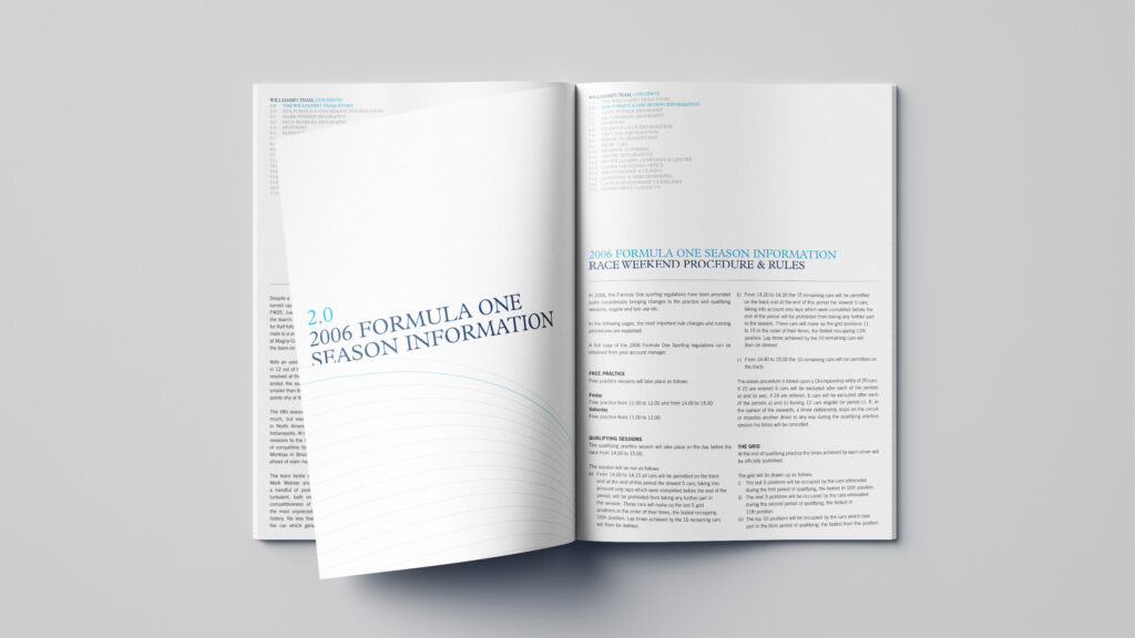
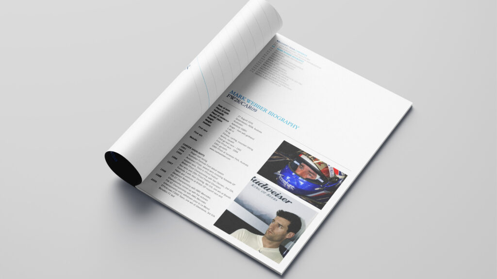
Sponsor guidelines
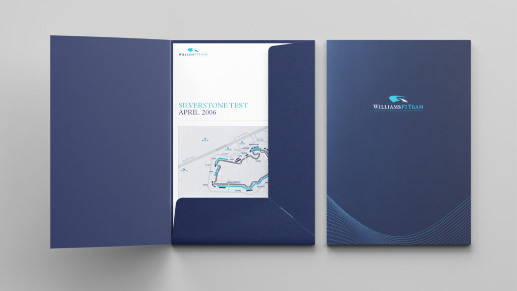
Test information folder
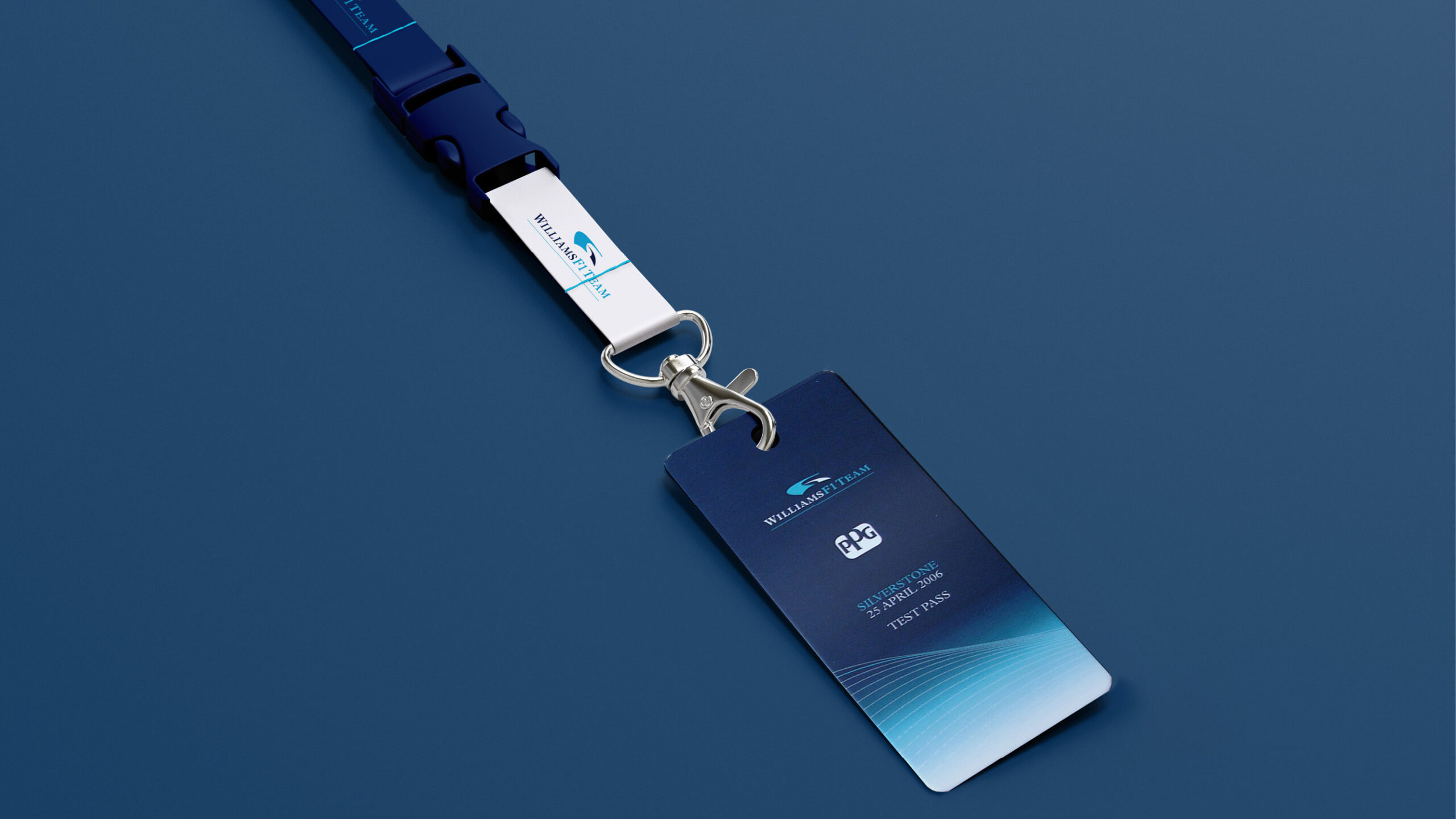
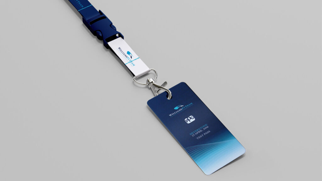
Test pass
Designed at Burnt Ltd